


How can the color matching of custom cabinets be coordinated with the overall home style?
Release Time : 2025-09-24
As the centerpiece of a kitchen, custom cabinets' color palette not only impacts the aesthetics of the space but also ensures a seamless integration with the overall home style. Color selection requires a comprehensive consideration of multiple factors, including the underlying style, spatial relationships, and material properties. Avoiding abrupt visual clashes while creating a sense of spatial rhythm through color layering, ultimately achieving a balance between functionality and aesthetics.
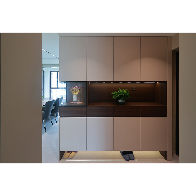
Modern minimalist homes emphasize clean lines and neutral tones, and the color palette of custom cabinets should follow this principle. Low-saturation colors like white, gray, and beige are preferred, creating a sense of space through pure visual clarity while infusing the kitchen with a tranquil atmosphere. To enhance the sense of depth, incorporate black or metallic accents in details like cabinet door handles and countertop edges, creating a modern feel through subtle color contrast. For example, a pure white cabinet with matte black handles maintains a clean, minimalist tone while enhancing the design through color contrast, perfectly complementing the overall minimalist style of the home.
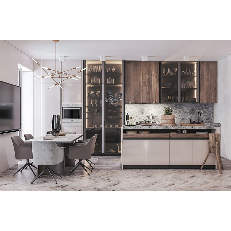
Industrial-inspired homes are characterized by rugged textures and neutral colors. The colors of custom cabinets should complement exposed brick walls and metal fixtures. Colors like dark gray, charcoal black, and rust red can evoke the raw texture of industrial materials, while cement-gray cabinets paired with black metal frames are a classic combination. If the space includes wooden elements, choose dark brown or walnut cabinet doors, creating a retro, industrial feel through the contrast of wood grain and metal. The key is to control the color purity, avoiding overly bright tones that undermine the cool, austere quality of the industrial style. The color contrast of different materials can also enrich the spatial depth.
Rustic-style homes pursue a natural, rustic aesthetic, so the colors of custom cabinets should reflect earth tones. Colors like off-white, light brown, and pale green can emulate the warmth of natural materials, while doors with distressed or faux wood grain can enhance the rustic feel. If the kitchen features a window view or greenery, cabinet colors can complement the natural surroundings. For example, a kitchen near a garden could use pale green cabinet doors to create a natural transition between indoor and outdoor colors. Additionally, soft furnishings like colorful tiles or floral curtains can further enliven the space, making the cabinets a harmonious addition to the rustic style.
Nordic-style homes are characterized by a bright and fresh aesthetic, so the colors of custom cabinets should balance functionality and decorative appeal. White cabinets are a classic choice for Nordic kitchens, reflecting light and making small spaces appear airy and spacious. To add a touch of color, consider using a light wood or pale blue for the island or tall cabinets, creating a contrasting effect. For example, pairing white floor cabinets with natural wood wall cabinets preserves the simplicity of Nordic style while enhancing the spatial dimension through vertical layering of materials and colors. The key is to control the color proportions to avoid visual clutter caused by a mix of colors.
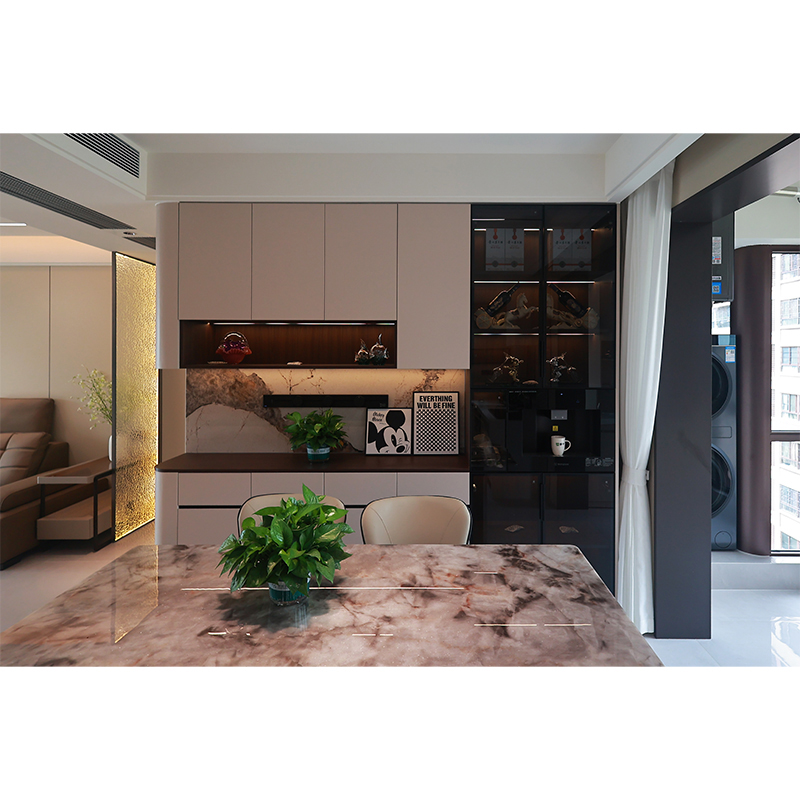
Color coordination also requires consideration of the lighting conditions of the space. In kitchens with ample natural light, dark cabinets, such as deep blue or dark green, can balance the intensity of the light through their richness. In contrast, in spaces with limited natural light, lighter colors should be chosen to utilize the reflective properties of the colors to enhance brightness. Furthermore, the color temperature of artificial lighting can affect color rendering. Warm light can produce a yellowish hue for cabinets, while cool light can produce a bluish hue. When designing, color choices should be adjusted based on the actual lighting conditions.
Material properties are a hidden factor in color matching. Matte doors create a warm atmosphere, while high-gloss cabinet tops enhance the modern feel of a space. Wooden cabinets have an inherently warm quality, and when paired with cool-toned countertops, they create a contrasting material and color. When designing, it's important to compare material samples and observe color variations under different lighting to ensure the final effect meets your expectations.
Color coordination in custom cabinets is essentially about unifying the spatial language. This requires designers to look beyond the perspective of a single piece of furniture and instead extract color dynamics from the overall home style. Then, through color combinations of elements like cabinets, countertops, and handles, a logical spatial narrative is constructed. Whether continuing the primary color palette or creating a focal point through contrasting colors, the ultimate goal is to make the cabinets a natural extension of the home style, rather than an isolated entity.